Agenda
The Agenda displays a list of events for a given period of time (year, month, week or day). It can be used as a standalone component or in combination with the calendar.
Overview
The agenda supports a configurable range listing along with daily, monthly and yearly presets.
The capabilities like recurring events, all-day, multi-day events, responsiveness are supported by agenda.
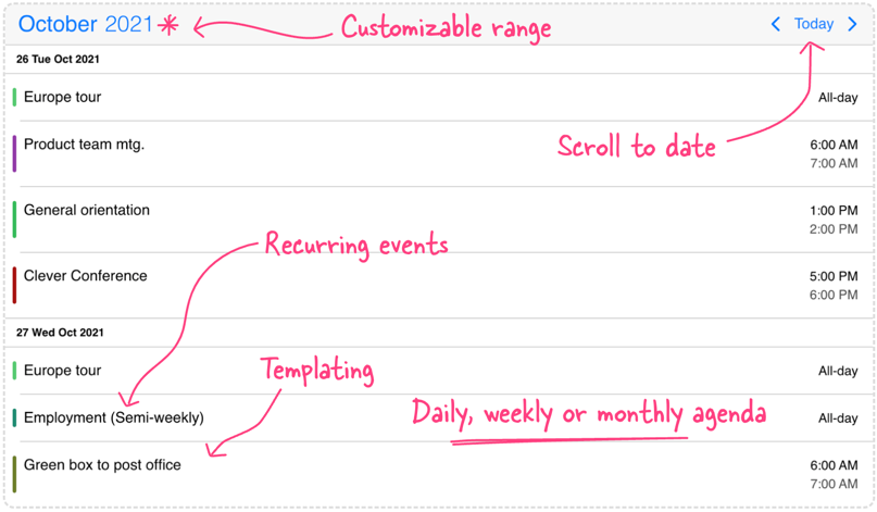
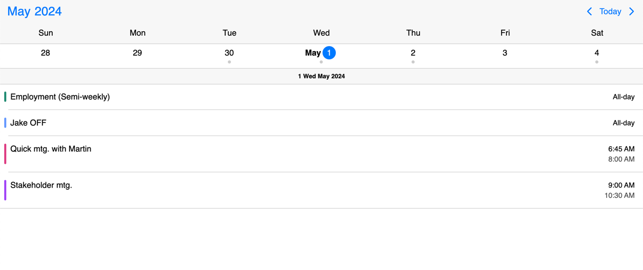
Showing the Agenda
View combination
The four views - scheduler, calendar, timeline, agenda - can be used alone or combined with each-other to create the perfect user experience on mobile, desktop and on everything in-between.
For example, you can combine a daily agenda with a weekly calendar for listing the events for the selected day. The view option will look like the following:
<mbsc-eventcalendar [view]="myView"></mbsc-eventcalendar>
import { MbscEventcalendarView } from '@mobiscroll/angular';

@Component({...})
export class MyComponent {
  myView: MbscEventcalendarView = {
    calendar: { type: 'week' },
    agenda: { type: 'day' }
  };
}
Configuring the view
The Agenda view can be configured through the view option. Below are listed the agenda object properties which can help you fine-tune this view.
<mbsc-eventcalendar [view]="myView"></mbsc-eventcalendar>
import { MbscEventcalendarView } from '@mobiscroll/angular';

@Component({...})
export class MyComponent {
  myView: MbscEventcalendarView = {
    agenda: { type: 'day', size: 2 }
  };
}
scrollable
boolean
When set to true, makes the event listing independently scrollable.
There are two prerequisites for making this work:
1 - The calendar needs to be to placed inside a container which has a height. This can be either a fixed height,
a height in percentage, or a flex height. When the calendar is placed directly in a container with a fixed height,
it will work out of the box. If the height of the container is specified in percentage,
e.g. you'd like to fill the full page height, you need to make sure that all parent elements also have 'height: 100%' specified,
up until the body and html elements, or until the closest parent which has a fixed height.
If the container is inside a parent with flex layout, it will also work out of the box.
2 - The agenda needs a minimum height of 200px - the result of the container height minus the height of the calendar header minus the height of the displayed calendar rows. If the calculated height is less then 200px, the agenda will not be scrollable.
showEmptyDays
boolean
Display the day headers for every day in the list, even for those without events.
Default value: false
size
number
Specifies the number of years, months, weeks or days included in the list (depending on the specified type).
Default value: 1
type
"day" | "month" | "year" | "week"
Sets the agenda type.
If calendar is also displayed, only 'month', 'week' and 'day' values are supported.
In case of month and week, the type and size should match the calendar type and size.
In case of day type events on the selected calendar day will be displayed, so size will always be 1.
Default value: 'month'
Responsiveness
The agenda is fully responsive. It adapts to the available space and fills the screen to look good everywhere. While you don't have to worry about the width the height can be manually adjusted with the height option. This specifies different options for different container widths, in a form of an object, where the keys are the name of the breakpoints, and the values are objects containing the options for the given breakpoint.
Use the responsive option to configure how the calendar behaves on different sized screens. The responsive option is equipped with five breakpoints:
xsmall(up to 575px),small(up to 767px),medium(up to 991px),large(up to 1199px),xlarge(from 1200px).
Also, custom breakpoints can be added if necessary:
my-custom-breakpoint: { breakpoint: 600 }(from 600px up to the next breakpoint).
The available width is queried from the container element of the component and not the browsers viewport like in css media queries.
<mbsc-eventcalendar [responsive]="responsiveSettings"></mbsc-eventcalendar>
import { MbscEventcalendarOptions } from '@mobiscroll/angular';

@Component({...})
export class MyComponent {
  responsiveSettings: MbscEventcalendarOptions = {
    xsmall: {
      view: {
        agenda: { type: 'week' }
      }
    },
    medium: {
      view: {
        calendar: { type: 'week' },
        agenda: { type: 'day' }
      }
    },
    custom: { // Custom breakpoint, you can use multiple if needed, but each must have a unique name.
      breakpoint: 1000,
      view: {
        calendar: { type: 'month' },
        agenda: { type: 'month' }
      }
    }
  }
}
Templating
The display of Agenda can be customized with different templating functions.
The event
Customize the events that appear on the agenda with theeventTemplate option. It should return the markup of the event. The event calendar will take care of the positioning, but everything else (like background color, hover effect, etc.) is left to you.
Check out how you can style events in this example or just play with the slider below to see the differences.
The event content
Customize the event content that appears on the agenda by using the eventContentTemplate option. The event calendar will take care of styling and you can focus on what you show inside of the event.
Check out how you can style event content in this example or just play with the slider below to see the differences.
The agenda header
Customize how the header of the event calendar looks and how the components are arranged with the headerTemplate option. It takes a function that should return the desired markup. In the returned markup, you can use custom html as well as the built in header components of the calendar.
While fully customizing the header is very usefull, sometimes it's desireable to customize only parts of it. In this case you can take advantage of the default header's building blocks. These components let you put toghether the header you want, while you don't have to worry about the functionality behind them.
Check out how you can style the header in this example or just play with the slider below to see the differences.
The agenda day header
Customize the day headers that appear on the agenda with the dayTemplate option. It should contain the markup for the day header.
Check out how you can style the day headers in this example or just play with the slider below to see the differences.
The agenda empty state
Customize the look of the empty state through agendaEmptyTemplate function. Give a more purposeful feedback to the user and optionally add further actions to it. The template can be totally custom or dynamic based on any criteria.
Check out how you can style the empty state in this example or just play with the slider below to see the differences.

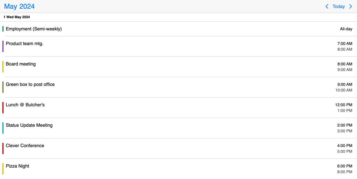
Event order
When rendering events, the following default order is applied:
- All-day events are placed at the top.
- Non-all-day events follow, sorted by their start times.
- Events with the same start time are ordered alphabetically by their titles.
To modify the default event order, you can use the order property of the event data. If the order property does not meet your requirements, the eventOrder option can be used to further customize the ordering, which expects a function that compares two events and returns an order (-1 or 1).
API
Here is a comprehensive list of all the specific options, events and methods of the Agenda view.
Options
Explore the following API options that help you easily configure the Agenda.
actionableEvents
boolean
Specifies if the events on the agenda and inside the calendar popover are actionable or not.
If actionable, the event items will have hover and active states, and pointer cursor.
Set to false when custom event rendering is used and the event list items contain other actionable elements, e.g. buttons.
Default value: true
context
string | HTMLElement
The DOM element in which the popups (event popover, year and month picker) are rendered. Can be a selector string or a DOM element.
Default value: 'body'
cssClass
string
Specifies a custom CSS class for the component.
Default value: undefined
data
Array<MbscCalendarEvent>
The events for the Eventcalendar.
The MbscCalendarEvent type has the following properties:
allDay: boolean - Specifies if the event is all day or not.bufferAfter: number - Defines a buffer time in minutes that will be displayed after the end of the event.bufferBefore: number - Defines a buffer time in minutes that will be displayed before the start of the event.cellCssClass: string - CSS class for the day cell. Only applicable for the calendar view.color: string - Background color of the eventcssClass: string - Specifies a custom CSS class that is applied to the event. Useful when customization is needed on the event level. For example: setting the width for specific events.date: string | object | Date - Specifies a single date for the eventdragBetweenResources: boolean - Specifies whether the event is movable across resources.dragBetweenSlots: boolean - Specifies whether the event is movable across across slots.dragInTime: boolean - Specifies whether the event is movable in time.editable: boolean - Specifies if an event is editable or not. If false, drag & drop and resize is not allowed.end: string | object | Date - Specifies the end date/time of a date/time range for the eventid: string | number - A unique id for the event. If not specified, the event will get a generated id.order: number - Specifies the order of the event in the array. Has precedence over the default ordering rules.overlap: boolean - Specifies whether the event can be overlapped. Has precedence over theeventOverlapproperty of the resource and the eventOverlap option.recurring: string | MbscRecurrenceRule - Specifies a recurrence rule for handling recurring events.recurringException: string | object | Date | Array<string | object | Date> - Exception dates of the recurring rule. Useful when specific dates need to be skipped from the rule.recurringExceptionRule: string | MbscRecurrenceRule - Exception rule of the recurring rule. Useful when recurring dates need to be skipped from the rule.resize: boolean - Specifies whether the event is resizable. Has precedence over theeventResizeproperty of the resource and the dragToResize option.resource: string | number | Array<string | number> - In case of the timeline and scheduler view of the Eventcalendar, specifies the resource ids for the event. The event will be displayed only on the specified resource. If there is no resource defined, it will be displayed on every resource.slot: string | number - In case of the timeline view of the Eventcalendar, specifies the slot id for the event. The event will be displayed only on the specified slot. If there is no slot defined, it will be displayed on every slot.start: string | object | Date - Specifies the start date/time of a date/time range for the eventtextColor: string - A color applied on the text.timezone: string - Timezone of the eventtitle: string - The title of the event.tooltip: string - The tooltip text of the event.
The dates can be specified as JavaScript Date objects, ISO 8601 strings, or moment objects.
For Javascript Date objects the month numbers are zero based. Like: 0 - January, 1 - February ... 11 - December.
The event objects may have additional custom properties as well. The custom properties are not used by the event calendar, but they are kept and will be available anywhere the event objects are used. E.g. the onEventClick event will receive the event object as argument, containing the custom properties as well.
Use the getEvents method to get the events between two dates.
data: [
  {
    start: new Date(2021, 5, 23),
    end: new Date(2021, 5, 30),
    title: 'Conference',
    allDay: true,
    color: 'red'
  },
  {
    title: 'Work project',
    recurring: {
      repeat: 'daily',
      until: '2021-04-01'
    },
    recurringException: ['2021-03-15', '2021-03-25'],
    recurringExceptionRule: {
      repeat: 'weekly',
      weekDays: 'SA,SU'
    }
  }
]
Default value: undefined
dataTimezone
string
The timezone in which the data is interpreted. If the data contains timezone information
(when the ISO string has a timezone offset, e.g. "2021-03-28T01:00:00Z" or "2021-03-28T03:00:00+03:00")
then the data's timezone is used instead.
When using timezones, the exclusiveEndDates option is also turned on by default.
When using anything other than the default ('local'), a timezone plugin
must be also passed to the component.
Possible values:
'local'- The system's local timezone.'utc'- UTC (Universal Coordinated Time) timezone.- Timezone name - The timezone name from the
IANA time zone database, e.g.
"America/New_York".
If not specified, it defaults to the displayTimezone.
Default value: undefined
defaultSelectedDate
Specifies the initial selected date on the calendar.
For views, where time is also displayed, the view will be scrolled to the specified time. If the time part is not explicitly specified, it defaults to the start of the day.
Default value: undefined
displayTimezone
string
The timezone in which the data is displayed.
When using timezones, the exclusiveEndDates option is also turned on by default.
When using anything other than the default ('local'), a timezone plugin
must be also passed to the component.
Possible values:
'local'- The system's local timezone.'utc'- UTC (Universal Coordinated Time) timezone.- Timezone name - The timezone name from the
IANA time zone database, e.g.
"America/New_York".
Default value: 'local'
eventOrder
(event1: MbscCalendarEvent, event2: MbscCalendarEvent) => number
Determines the ordering of the events within the same day. Can be a function that accepts two event objects as arguments and should return -1 or 1.
If not specified, the default order is:
- all day events
- rest of events, sorted by start time; events with identical start times, will be ordered alphabetically based on their title
Default value: undefined
exclusiveEndDates
boolean
If true, the Eventcalendar will work in exclusive end dates mode,
meaning that the last moment of the range (event, invalid, colors, etc.) is not part of the range.
E.g. end: '2021-07-03T00:00' means that the event ends on 2nd of July and will not be displayed on 3rd of July.
When using timezones, the exclusiveEndDates option will default to true.
height
string | number
Sets the height of the component.
The height of the calendar view impacts the number of labels that fit into a table cell. A "show more" label will be displayed for events that don't fit.
Default value: undefined
immutableData
boolean
If true, the Eventcalendar will work in immutable mode.
In this mode the component won't update the data directly,
only fire the necessary lifecycle events, where the original data can be updated manually.
Default value: undefined
max
Maximum date and time. The calendar cannot be navigated beyond the specified maximum date. If navigation is needed, but event creation should not be allowed after a specific date, use the invalid option with daily recurrence starting from the specific date.
Default value: undefined
min
Minimum date and time. The calendar cannot be navigated beyond the specified minimum date. If navigation is needed, but event creation should not be allowed before a specific date, use the invalid option with daily recurrence until the specific date.
Default value: undefined
modules
Array<IModule>
Additional modules can be added to the eventcalendar. The option receives an array of module objects. For example, the print module can be added through this option.
// import the print module
import { print } from '@mobiscroll/print';

// later on, add it to the modules array:
modules: [print]
refDate
Specifies the reference date for the view calculation, when multiple days, weeks, months or years are displayed. If not specified, for the scheduler and timeline views will be today's date, for the calendar and agenda views will be 1970/01/01.
It denotes the reference point when calculating the pages going in the future and in the past.
For example if the view type is day, the view size is 3, and the current date is 01/16/2024,
the pages are calculated from this date, so the initial page will contain [01/16/2024, 01/16/2024, 01/17/2024],
the next page [01/18/2024, 01/19/2024, 01/20/2024] and so on.
In case of day view, the reference point will be exactly the specified date. For week, month and year views the reference point will be the start of the week, month or year of the specified day.
Changing the reference date will not navigate the calendar to the specified date, it only recalculates the pages from the new reference date. To navigate the view to a specified date and time, use the selectedDate option.
Default value: undefined
responsive
MbscResponsiveOptions<MbscEventcalendarOptions>
Specifies different options for different container widths, in a form of an object, where the keys are the name of the breakpoints, and the values are objects containing the options for the given breakpoint.
The available width is queried from the container element of the component and not the browsers viewport like in css media queries
There are five predefined breakpoints:
xsmall- min-width: 0pxsmall- min-width: 576pxmedium- min-width: 768pxlarge- min-width: 992pxxlarge- min-width: 1200px
Custom breakpoints can be defined by passing an object containing the breakpoint property specifying the min-width in pixels.
Example:
responsive: {
  small: {
    display: 'bottom'
  },
  custom: { // Custom breakpoint, you can use multiple, but each must have a unique name
    breakpoint: 600,
    display: 'center'
  },
  large: {
    display: 'anchored'
  }
}
Default value: undefined
selectMultipleEvents
boolean
When true, enables multiple event selection on the calendar.
Default value: false
selectedDate
Specifies the selected date on the calendar. This can be changed programmatically and when changed the calendar will automatically navigate to the specified date.
For views, where time is also displayed, the view will be scrolled to the specified time. If the time part is not explicitly specified, it defaults to the start of the day.
This does not change the reference date that defines the reference point of the navigation pages. To change the reference point for the navigation (e.g. start the paging from the newly selected date) use the refDate option.
You also need to pass a handler for the onSelectedDateChange event to update the selected date when the date is changed from the calendar.
Default value: undefined
selectedEvents
Array<MbscCalendarEvent>
Specifies the selected events on the calendar. The onSelectedEventsChange event will be fired when the selected events change from the calendar.
The MbscCalendarEvent type has the following properties:
allDay: boolean - Specifies if the event is all day or not.bufferAfter: number - Defines a buffer time in minutes that will be displayed after the end of the event.bufferBefore: number - Defines a buffer time in minutes that will be displayed before the start of the event.cellCssClass: string - CSS class for the day cell. Only applicable for the calendar view.color: string - Background color of the eventcssClass: string - Specifies a custom CSS class that is applied to the event. Useful when customization is needed on the event level. For example: setting the width for specific events.date: string | object | Date - Specifies a single date for the eventdragBetweenResources: boolean - Specifies whether the event is movable across resources.dragBetweenSlots: boolean - Specifies whether the event is movable across across slots.dragInTime: boolean - Specifies whether the event is movable in time.editable: boolean - Specifies if an event is editable or not. If false, drag & drop and resize is not allowed.end: string | object | Date - Specifies the end date/time of a date/time range for the eventid: string | number - A unique id for the event. If not specified, the event will get a generated id.order: number - Specifies the order of the event in the array. Has precedence over the default ordering rules.overlap: boolean - Specifies whether the event can be overlapped. Has precedence over theeventOverlapproperty of the resource and the eventOverlap option.recurring: string | MbscRecurrenceRule - Specifies a recurrence rule for handling recurring events.recurringException: string | object | Date | Array<string | object | Date> - Exception dates of the recurring rule. Useful when specific dates need to be skipped from the rule.recurringExceptionRule: string | MbscRecurrenceRule - Exception rule of the recurring rule. Useful when recurring dates need to be skipped from the rule.resize: boolean - Specifies whether the event is resizable. Has precedence over theeventResizeproperty of the resource and the dragToResize option.resource: string | number | Array<string | number> - In case of the timeline and scheduler view of the Eventcalendar, specifies the resource ids for the event. The event will be displayed only on the specified resource. If there is no resource defined, it will be displayed on every resource.slot: string | number - In case of the timeline view of the Eventcalendar, specifies the slot id for the event. The event will be displayed only on the specified slot. If there is no slot defined, it will be displayed on every slot.start: string | object | Date - Specifies the start date/time of a date/time range for the eventtextColor: string - A color applied on the text.timezone: string - Timezone of the eventtitle: string - The title of the event.tooltip: string - The tooltip text of the event.
Default value: undefined
separator
string
Separator between date and time in the formatted date string.
Default value: ' '
showControls
boolean
Show or hide the calendar header controls: the previous and next buttons, and the current view button together with the year and month picker.
Default value: true
showEventBuffer
boolean
If true, it will display the event buffers defined in the event data.
Default value: true
showEventTooltip
boolean
If false, it will hide the native tooltip that shows up when hovering over an event.
Default value: true
theme
string
Specifies the visual appearance of the component.
If it is 'auto' or undefined, the theme will automatically be chosen based on the platform.
If custom themes are also present, they will take precedence over the built in themes, e.g. if there's an iOS based custom theme,
it will be chosen on the iOS platform instead of the default iOS theme.
Supplied themes:
'ios'- iOS theme'material'- Material theme'windows'- Windows theme
It's possible to modify theme colors or create custom themes.
Make sure that the theme you set is included in the downloaded package.
Default value: undefined
themeVariant
"auto" | "light" | "dark"
Controls which variant of the theme will be used (light or dark).
Possible values:
'light'- Use the light variant of the theme.'dark'- Use the dark variant of the theme.'auto'orundefined- Detect the preferred system theme on devices where this is supported.
To use the option with custom themes, make sure to create two custom themes, where the dark version has the same name as the light one,
suffixed with '-dark', e.g.: 'my-theme' and 'my-theme-dark'.
Default value: undefined
timezonePlugin
Specifies the timezone plugin, which can handle the timezone conversions.
By default the component uses the local timezone of the browser to interpret dates. If you want to interpret dates a different timezone, you will need an external library to handle the timezone conversions. There are two supported libraries: moment-timezone and luxon.
You can specify either the dataTimezone or the displayTimezone or both.
Depending on which external library you use you can pass either the momentTimezone, dayjsTimezone or luxonTimezone
objects. These objects can be imported from the mobiscroll bundle.
Default value: undefined
The MbscTimezonePlugin type has the following properties:
createDate: (s: any, year: string | number | Date | MbscTimezonedDate, month: number, date: number, h: number, min: number, sec: number, ms: number) => MbscTimezonedDate -parse: (date: string | number, s: any) => MbscTimezonedDate -
width
string | number
Sets the width of the component.
Default value: undefined
Events
The Agenda ships with different event hooks for deep customization. Events are triggered through the lifecycle of the component where you can tie in custom functionality and code.
onDestroy
(args: any, inst: any) => void
Triggered when the component is destroyed.
Parameters:
-
args - The event argument object.
-
inst - The component instance.
onEventClick
(args: MbscEventClickEvent, inst: EventcalendarBase) => void
Triggered when an event is clicked.
Parameters:
-
args - The event argument with the following properties:
date: Date - The date on which the event was clicked. In case of the timeline view, this will be the first day of the event on the current view.domEvent: Event - The DOM event of the click.event: MbscCalendarEvent - The clicked calendar event.resource: string | number - The id of the resource where the event was clicked, if resources are set.resourceObj: MbscResource - The resource where the event was clicked, if resources are set.slot: string | number - The id of the slot where the event was clicked, if slots are set.slotObj: MbscSlot - The slot where the event was clicked, if slots are set.source: 'agenda' | 'calendar' | 'schedule' | 'timeline' | 'popover' - The view where the event was clicked.target: HTMLElement - The DOM element of the event.
-
inst - The component instance.
onEventDeleted
(args: MbscEventDeletedEvent, inst: EventcalendarBase) => void
Triggered when an event is deleted and it is removed from the view.
Parameters:
-
args - The event argument with the following properties:
event: MbscCalendarEvent - The deleted event.events: Array<MbscCalendarEvent> - The deleted events in case of multiple event selection.source: 'agenda' | 'calendar' | 'timeline' | 'schedule' - The view where the event was deleted.
-
inst - The component instance.
onEventDoubleClick
(args: MbscEventClickEvent, inst: EventcalendarBase) => void
Triggered when an event is double-clicked.
Parameters:
-
args - The event argument with the following properties:
date: Date - The date on which the event was clicked. In case of the timeline view, this will be the first day of the event on the current view.domEvent: Event - The DOM event of the click.event: MbscCalendarEvent - The clicked calendar event.resource: string | number - The id of the resource where the event was clicked, if resources are set.resourceObj: MbscResource - The resource where the event was clicked, if resources are set.slot: string | number - The id of the slot where the event was clicker, if slots are set.slotObj: MbscResource - The resource where the event was clicker, if slots are set.source: 'agenda' | 'calendar' | 'schedule' | 'timeline' | 'popover' - The view where the event was clicked.target: HTMLElement - The DOM element of the event.
-
inst - The component instance.
onEventHoverIn
(args: MbscEventClickEvent, inst: EventcalendarBase) => void
Triggered when the mouse pointer hovers an event on the calendar.
Parameters:
-
args - The event argument with the following properties:
date: Date - The date on which the event is hovered. In case of the timeline view, this will be the first day of the event on the current view.domEvent: Event - The DOM event of the hover.event: MbscCalendarEvent - The hovered calendar event.resource: string | number - The id of the resource where the event is hovered, if resources are set.resourceObj: MbscResource - The resource where the event is hovered, if resources are set.slot: string | number - The id of the slot where the event is hovered, if slots are set.slotObj: MbscSlot - The slot where the event is hovered, if slots are set.source: 'agenda' | 'calendar' | 'schedule' | 'timeline' | 'popover' - The view where the event is hovered.target: HTMLElement - The DOM element of the event.
-
inst - The component instance.
onEventHoverOut
(args: MbscEventClickEvent, inst: EventcalendarBase) => void
Triggered when the mouse pointer leaves an event on the calendar.
Parameters:
-
args - The event argument with the following properties:
date: Date - The date on which the event was hovered. In case of the timeline view, this will be the first day of the event on the current view.domEvent: Event - The DOM event of the hover.event: MbscCalendarEvent - The hovered calendar event.resource: string | number - The id of the resource where the event was hovered, if resources are set.resourceObj: MbscResource - The resource where the event was hovered, if resources are set.slot: string | number - The id of the slot where the event was hovered, if slots are set.slotObj: MbscSlot - The slot where the event was hovered, if slots are set.source: 'agenda' | 'calendar' | 'schedule' | 'timeline' | 'popover' - The view where the event was hovered.target: HTMLElement - The DOM element of the event.
-
inst - The component instance.
onEventRightClick
(args: MbscEventClickEvent, inst: EventcalendarBase) => void
Triggered when an event is right-clicked.
Parameters:
-
args - The event argument with the following properties:
date: Date - The date on which the event was clicked. In case of the timeline view, this will be the first day of the event on the current view.domEvent: Event - The DOM event of the click.event: MbscCalendarEvent - The clicked calendar event.resource: string | number - The id of the resource where the event was clicked, if resources are set.resourceObj: MbscResource - The resource where the event was clicked, if resources are set.slot: string | number - The id of the slot where the event was clicked, if slots are set.slotObj: MbscSlot - The slot where the event was clicked, if slots are set.source: 'agenda' | 'calendar' | 'schedule' | 'timeline' | 'popover' - The view where the event was clicked.target: HTMLElement - The DOM element of the event.
-
inst - The component instance.
onInit
(args: any, inst: any) => void
Triggered when the component is initialized.
Parameters:
-
args - The event argument object.
-
inst - The component instance.
onPageChange
(args: MbscPageChangeEvent, inst: EventcalendarBase) => void
Triggered when the calendar page is changed (with buttons or swipe).
Parameters:
-
args - The event argument with the following properties:
firstDay: Date - The first day of the displayed page.lastDay: Date - The last day of the displayed page, as an exclusive end date, pointing to 00:00 of the next day.month: Date - The first day of the visible month in case of month view.
-
inst - The component instance.
onPageLoaded
(args: MbscPageLoadedEvent, inst: EventcalendarBase) => void
Triggered when the calendar page is changed (with buttons or swipe) and the view finished rendering.
Parameters:
-
args - The event argument with the following properties:
firstDay: Date - The first day of the displayed page.lastDay: Date - The last day of the displayed page, as an exclusive end date, pointing to 00:00 of the next day.month: Date - The first day of the visible month in case of month view.
-
inst - The component instance.
onPageLoading
(args: MbscPageLoadingEvent, inst: EventcalendarBase) => void
Triggered before the markup of a calendar page is starting to render.
Parameters:
-
args - The event argument with the following properties:
firstDay: Date - The first day of the displayed page.lastDay: Date - The last day of the displayed page, as an exclusive end date, pointing to 00:00 of the next day.month: Date - The first day of the visible month in case of month view.
-
inst - The component instance.
onSelectedDateChange
(args: MbscSelectedDateChangeEvent, inst: EventcalendarBase) => void
Triggered when the selected date is changed, e.g. by clicking on a day on a calendar view, or by using the navigation arrows. You can use this event in conjunction with the selectedDate option to customize where the Eventcalendar should navigate.
Parameters:
-
args - The event argument with the following properties:
date: Date - The newly selected date.
-
inst - The component instance.
onSelectedEventsChange
(args: MbscSelectedEventsChangeEvent, inst: EventcalendarBase) => void
Triggered when an event is selected or deselected on the UI, when multiple event selection is enabled.
You can also select events programmatically using the selectedEvents option.
Parameters:
-
args - The event argument with the following properties:
events: Array<MbscCalendarEvent> - The selected events.
-
inst - The component instance.
Localization
The Agenda is fully localized. This covers date and time format, button copy, rtl and more.
allDayText
string
Text for all day events.
Default value: 'All-day'
amText
string
Text for AM.
Default value: 'am'
calendarSystem
MbscCalendarSystem
Specifies the calendar system to be used. Supported calendars:
- Gregorian - Gregorian calendar. This is the default calendar system.
- Jalali - Persian calendar. The Farsi language needs to be included to the package.
- Hijri - Hijri calendar. The Arabic language needs to be included to the package
Default value: undefined
dateFormat
string
The format for parsed and displayed dates:
M- month of year (no leading zero)MM- month of year (two digit)MMM- month name shortMMMM- month name longD- day of month (no leading zero)DD- day of month (two digit)DDD- day of week (short)DDDD- day of week (long)YY- year (two digit)YYYY- year (four digit)'...'- literal text''- single quote- anything else - literal text
Default value: 'MM/DD/YYYY'
dateFormatFull
string
Human readable date format, used by screen readers to read out full dates. Characters have the same meaning as in the dateFormat option.
Default value: 'DDDD, MMMM D, YYYY'
dateFormatLong
string
Long date format, used by the agenda view and timeline day headers. Characters have the same meaning as in the dateFormat option.
Default value: 'D DDD MMM YYYY'
dayNames
Array<string>
The list of long day names, starting from Sunday.
Default value: ['Sunday', 'Monday', 'Tuesday', 'Wednesday', 'Thursday', 'Friday', 'Saturday']
dayNamesMin
Array<string>
The list of minimal day names, starting from Sunday.
Default value: ['S', 'M', 'T', 'W', 'T', 'F', 'S']
dayNamesShort
Array<string>
The list of abbreviated day names, starting from Sunday.
Default value: ['Sun', 'Mon', 'Tue', 'Wed', 'Thu', 'Fri', 'Sat']
firstDay
number
Set the first day of the week: Sunday is 0, Monday is 1, etc.
Default value: 0
locale
Sets the language of the component. The locale object contains all the translations for a given language. The built in language modules are listed below. If a language is not listed, it can be provided as a custom language module.
Supported values:
- Arabic:
localeAr,'ar' - Bulgarian:
localeBg,'bg' - Catalan:
localeCa,'ca' - Czech:
localeCs,'cs' - Chinese:
localeZh,'zh' - Croatian:
localeHr,'hr' - Danish:
localeDa,'da' - Dutch:
localeNl,'nl' - English:
localeEnorundefined,'en' - English (UK):
localeEnGB,'en-GB' - Farsi:
localeFa,'fa' - German:
localeDe,'de' - Greek:
localeEl,'el' - Spanish:
localeEs,'es' - Finnish:
localeFi,'fi' - French:
localeFr,'fr' - Hebrew:
localeHe,'he' - Hindi:
localeHi,'hi' - Hungarian:
localeHu,'hu' - Italian:
localeIt,'it' - Japanese:
localeJa,'ja' - Korean:
localeKo,'ko' - Lithuanian:
localeLt,'lt' - Norwegian:
localeNo,'no' - Polish:
localePl,'pl' - Portuguese (Brazilian):
localePtBR,'pt-BR' - Portuguese (European):
localePtPT,'pt-PT' - Romanian:
localeRo,'ro' - Russian:
localeRu,'ru' - Russian (UA):
localeRuUA,'ru-UA' - Slovak:
localeSk,'sk' - Serbian:
localeSr,'sr' - Swedish:
localeSv,'sv' - Thai:
localeTh,'th' - Turkish:
localeTr,'tr' - Ukrainian:
localeUa,'ua'
Default value: undefined
monthNames
Array<string>
The list of full month names.
Default value: ['January', 'February', 'March', 'April', 'May', 'June', 'July', 'August', 'September', 'October', 'November', 'December']
monthNamesShort
Array<string>
The list of abbreviated month names.
Default value: ['Jan', 'Feb', 'Mar', 'Apr', 'May', 'Jun', 'Jul', 'Aug', 'Sep', 'Oct', 'Nov', 'Dec']
nextPageText
string
Text for the next button in the calendar header, used as accessibility label.
Default value: 'Next page'
noEventsText
string
Text for empty event list.
Default value: 'No events'
pmText
string
Text for PM.
Default value: 'pm'
prevPageText
string
Text for the previous button in the calendar header, used as accessibility label.
Default value: 'Previous page'
rtl
boolean
Enables right-to-left display.
Default value: false
timeFormat
string
The format for parsed and displayed times:
h- 12 hour format (no leading zero)hh- 12 hour format (leading zero)H- 24 hour format (no leading zero)HH- 24 hour format (leading zero)m- minutes (no leading zero)mm- minutes (leading zero)s- seconds (no leading zero)ss- seconds (leading zero)a- lowercase am/pmA- uppercase AM/PM'...'- literal text''- single quote- anything else - literal text
Default value: 'hh:mm A'
todayText
string
Text for the "Today" button.
Default value: 'Today'
Templates
The display of the Agenda can be customized with different templating functions.
agendaEmptyTemplate
Template to customize the agenda empty state. Should contain the desired template to be used in the agenda when the events list is empty.
agendaTemplate
Template to customize agenda listing.
There is a scrolling functionality of the list: when clicking on a calendar date scrolls to the date on the list as well,
and scrolling the list updates the selected date on the calendar.
For this functionality to work, you need to use the mbsc-event-list-day directive on the elements of
the days in your template with the day timestamp as parameter:
<mbsc-eventcalendar [agendaTemplate]="myTemplate">
  <ng-template #myTemplate let-data>
    <ul *ngFor="let day of data; trackBy: getDayKey" mbsc-event-list-day [timestamp]="day.timestamp">
      <li>{{day.date}}</li>
      <li *ngFor="let event of day.events; trackBy: getEventKey">
        {{event.title}}
      </li>
    </ul>
  </ng-template>
</mbsc-eventcalendar>
The template data is an array containing the events of the current view, grouped by day. A day object has the following properties:
date: String - The formatted date of the day.events: Array - The list of events for the day. An event object has the following properties:allDay: String - The localized all-day text in case of all day events.end: String - The formatted end time, if the event is not all day.id: String - The id of the event.isMultiDay: Boolean - True if the event spans across multiple days.lastDay: Boolean - True if it's rendered on the last day of a multiple event.original: Object - The original event object.start: String - The formatted start time, if the event is not all day.title: String - The title of the event.
timestamp: Number - The timestamp of the day
dayTemplate
Customize the day cells of the calendar view and the date header in case of scheduler and timeline views.
If you are looking to customize only the day cells content and don't want to bother with the styling of the event, in case of calendar and scheduler views you can use the dayContentTemplate option.
The template will receive an object as data. This data can be used to show day specific things on the Eventcalendar. The object passed to the template has the following properties:
date: Date object - The specific date as a Date object.selected: Boolean - True if the date is selected. (In case of calendar view)events: Array - The list of events of the day.resource: String, Number - The id of the resource in case of scheduler(week and month views) when the events are grouped by resources.isActive: Boolean - On the timeline view, this parameter will be true when rendering the current day/week/month/year
Default value: undefined
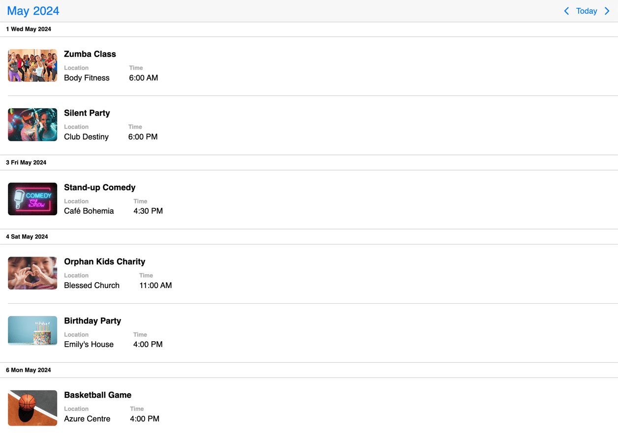
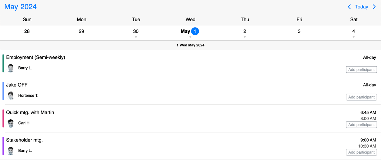
eventContentTemplate
Template to customize the event content that appears on the agenda and the popover. The Eventcalendar will take care of styling and you can focus on what you show inside of the event.
If you are looking to fully customize the event (e.g. add custom hover effects) you will need to use the eventTemplate option.
Some of the event specific details are computed, but there is also a reference to the original event they come from. The following event specific properties are available:
allDay: string - The localized all-day text in case of all day events.end: string - The formatted end time, if the event is not all day.id: string - The id of the event.isMultiDay: boolean - True if the event spans across multiple days.lastDay: boolean - True if it's rendered on the last day of a multiple event.original: MbscCalendarEvent - The original event object. Any custom property on the event can be accessed through this property.start: string - The formatted start time, if the event is not all day.title: string - The title of the event.
Default value: undefined
eventTemplate
Template to customize the events that appear on the agenda and the popover.
If you are looking to customize only the content (e.g. add custom elements) and don't want to bother with the styling of the event, you can use the eventContentTemplate option.
Some of the event specific details are computed, but there is also a reference to the original event they come from. The following event specific properties are available:
allDay: string - The localized all-day text in case of all day events.end: string - The formatted end time, if the event is not all day.id: string - The id of the event.isMultiDay: boolean - True if the event spans across multiple days.lastDay: boolean - True if it's rendered on the last day of a multiple event.original: MbscCalendarEvent - The original event object.start: string - The formatted start time, if the event is not all day.title: string - The title of the event.
Default value: undefined
headerTemplate
Template to customize the header of the event calendar. You can use custom markup or components as well as the built in header components of the calendar.
Default value: undefined
Types
MbscCalendarEvent
Interface
Properties:
allDay: boolean - Specifies if the event is all day or not.bufferAfter: number - Defines a buffer time in minutes that will be displayed after the end of the event.bufferBefore: number - Defines a buffer time in minutes that will be displayed before the start of the event.cellCssClass: string - CSS class for the day cell. Only applicable for the calendar view.color: string - Background color of the eventcssClass: string - Specifies a custom CSS class that is applied to the event. Useful when customization is needed on the event level. For example: setting the width for specific events.date: string | object | Date - Specifies a single date for the eventdragBetweenResources: boolean - Specifies whether the event is movable across resources.dragBetweenSlots: boolean - Specifies whether the event is movable across across slots.dragInTime: boolean - Specifies whether the event is movable in time.editable: boolean - Specifies if an event is editable or not. If false, drag & drop and resize is not allowed.end: string | object | Date - Specifies the end date/time of a date/time range for the eventid: string | number - A unique id for the event. If not specified, the event will get a generated id.order: number - Specifies the order of the event in the array. Has precedence over the default ordering rules.overlap: boolean - Specifies whether the event can be overlapped. Has precedence over theeventOverlapproperty of the resource and the eventOverlap option.recurring: string | MbscRecurrenceRule - Specifies a recurrence rule for handling recurring events.recurringException: string | object | Date | Array<string | object | Date> - Exception dates of the recurring rule. Useful when specific dates need to be skipped from the rule.recurringExceptionRule: string | MbscRecurrenceRule - Exception rule of the recurring rule. Useful when recurring dates need to be skipped from the rule.resize: boolean - Specifies whether the event is resizable. Has precedence over theeventResizeproperty of the resource and the dragToResize option.resource: string | number | Array<string | number> - In case of the timeline and scheduler view of the Eventcalendar, specifies the resource ids for the event. The event will be displayed only on the specified resource. If there is no resource defined, it will be displayed on every resource.slot: string | number - In case of the timeline view of the Eventcalendar, specifies the slot id for the event. The event will be displayed only on the specified slot. If there is no slot defined, it will be displayed on every slot.start: string | object | Date - Specifies the start date/time of a date/time range for the eventtextColor: string - A color applied on the text.timezone: string - Timezone of the eventtitle: string - The title of the event.tooltip: string - The tooltip text of the event.
MbscDateType
string | Date | object
MbscLocale
Interface
Properties:
allDayText: stringamText: stringcalendarSystem: MbscCalendarSystemcancelText: stringclearText: stringcloseText: stringdateFormat: stringdateFormatFull: stringdateFormatLong: stringdateText: stringdateWheelFormat: stringdayNames: Array<string>dayNamesMin: Array<string>dayNamesShort: Array<string>daySuffix: stringdayText: stringeventText: stringeventsText: stringfilterEmptyText: stringfilterPlaceholderText: stringfirstDay: numberfromText: stringhourText: stringminuteText: stringmonthNames: Array<string>monthNamesShort: Array<string>monthSuffix: stringmonthText: stringmoreEventsPluralText: stringmoreEventsText: stringnextMonthText: stringnextYearText: stringnoEventsText: stringnowText: stringpmText: stringprevMonthText: stringprevYearText: stringrangeEndHelp: stringrangeEndLabel: stringrangeStartHelp: stringrangeStartLabel: stringrtl: booleansecondText: stringselectedPluralText: stringselectedText: stringsetText: stringtimeFormat: stringtimeText: stringtimeWheels: stringtoText: stringtodayText: stringweekText: stringyearSuffix: stringyearText: string
MbscRecurrenceRule
Interface
Properties:
count: numberday: number | Array<number>from: MbscDateTypeinterval: numbermonth: number | Array<number>pos: numberrepeat: "daily" | "weekly" | "monthly" | "yearly"until: MbscDateTypeweekDays: stringweekStart: string
MbscResponsiveOptions<MbscEventcalendarOptions>
Interface
The MbscResponsiveOptions<MbscEventcalendarOptions> supports custom properties in the form:
[key:string]: MbscEventcalendarOptions & {breakpoint?: number}
The keys are the names of the breakpoints, and the values are objects containing the options for the given breakpoint.
The breakpoint property, when present, specifies the min-width in pixels. The options will take into effect from that width.
The available width is queried from the container element of the component and not the browsers viewport like in css media queries
There are five predefined breakpoints:
xsmall- min-width: 0pxsmall- min-width: 576pxmedium- min-width: 768pxlarge- min-width: 992pxxlarge- min-width: 1200px
MbscTimezonePlugin
Interface
Properties:
createDate: (s: any, year: string | number | Date | MbscTimezonedDate, month: number, date: number, h: number, min: number, sec: number, ms: number) => MbscTimezonedDateparse: (date: string | number, s: any) => MbscTimezonedDate