Templating
Overview
You can customize many parts of the Eventcalendar by writing custom templates. In React terms these templates are render functions or functional components. You will find a comprehensive list of all the available render functions for the Eventcalendar in the API renderers section.
Event templating
When you want to customize how the events look, depending on what your goal is, you have two options:
- Customize the event content - Mobiscroll takes care of rendering the events in the correct order and also prints basic fields, like
start/end, whether it is anallDayevent or not and also takes care of coloring the event appropriately. Everything else comes from the custom template. - Customize the full event - Mobiscroll takes care of rendering the events in the correct order, but everything else comes form the template you write.
To define a custom template, pass a functional component to the apropriate option:
import { Eventcalendar } from '@mobiscroll/react';
import '@mobiscroll/react/dist/css/mobiscroll.min.css';

const myScheduleEventContent = (theEvent) => {
  return <div>
      {theEvent.title}
      {/* or any content you want */}
    </div>
}

<Eventcalendar renderSchedulerEventContent={myScheduleEventContent} />
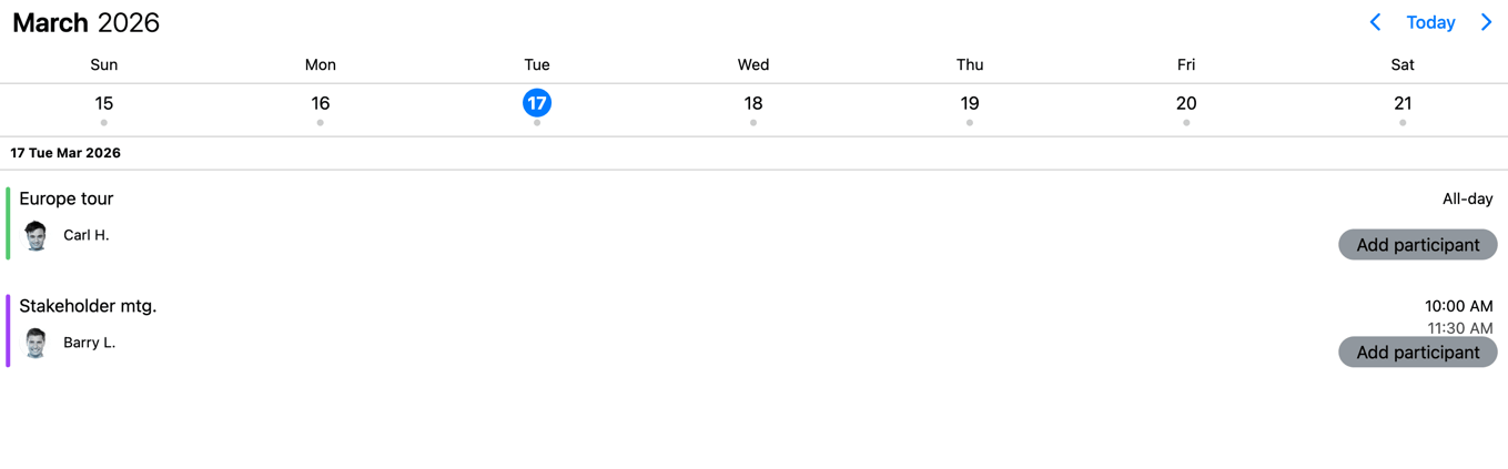
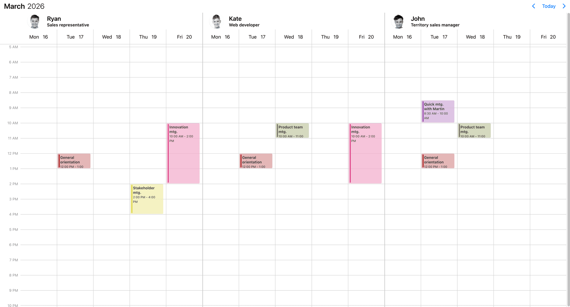
Event content templating
In most cases you only want to customize the content section of the event. In this case your template will be used as the content of the event. Mobiscroll will position the event to the right place and will render essential information like the color of the event, the time and if it's an all day event or not. The title, description and any other fields you want to show (like participants, an avatar...) will be coming from your custom template.
- For the agenda - use the
renderAgendaEventContentoption for the custom template - For the popover - use the
renderPopoverEventContentoption for the custom template - For event labels in the calendar - use the
renderCalendarEventContentoption for the custom template - For the scheduler - use the
renderSchedulerEventContentoption for the custom template - For the timeline - use the
renderTimelineEventContentoption for the custom template
import { Eventcalendar } from '@mobiscroll/react';
import '@mobiscroll/react/dist/css/mobiscroll.min.css';

const myContent = (theEvent) => {
  // your content here
}

<Eventcalendar renderAgendaEventContent={myContent} />
Play with the slider below to see the differences.

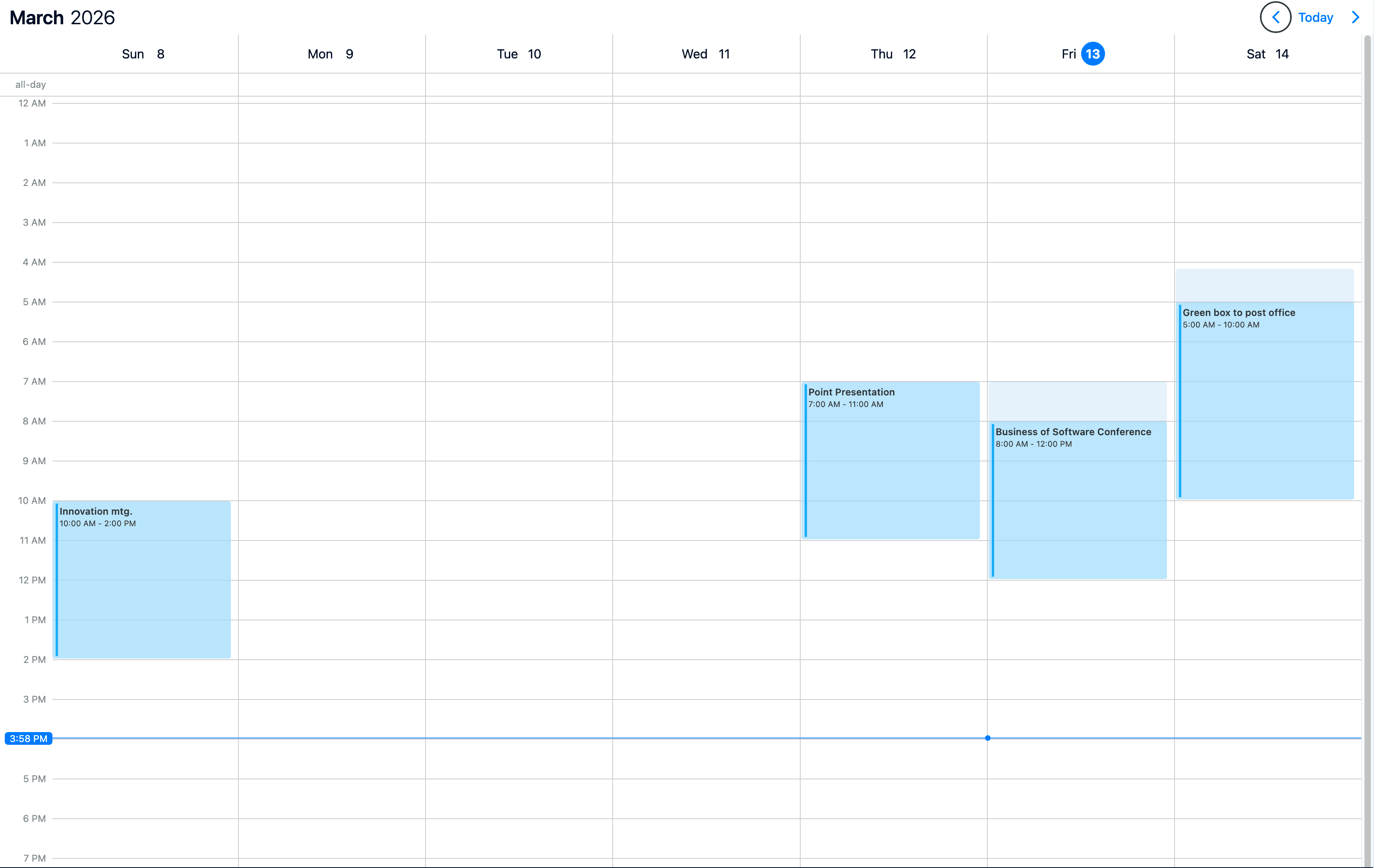
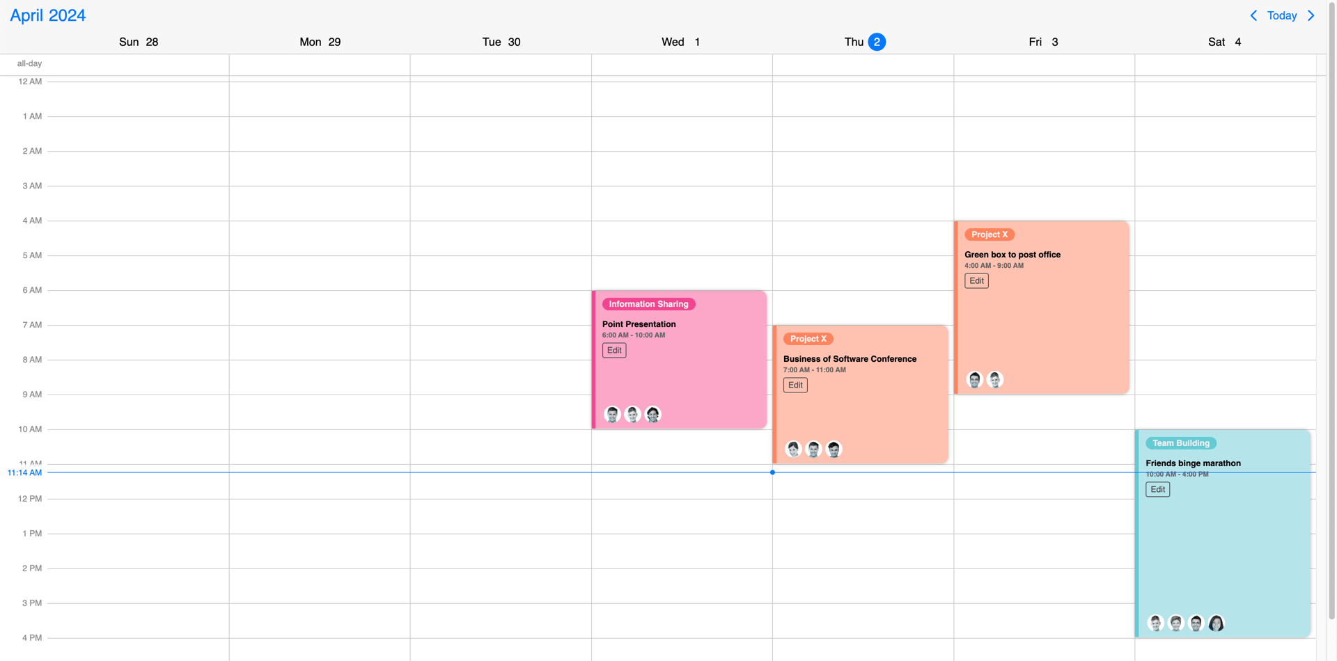
Full event templating
In case of full event templating, whenever there is an event (in the agenda, scheduler, timeline, labels or popover) your custom template will be used instead of the default template. Mobiscroll will position your component to the right place, but anything else you want to show is up to you... like a title, description, color the background or show any content.
- For the agenda - use the
renderAgendaEventoption for the custom template - For the popover - use the
renderPopoverEventoption for the custom template - For event labels in the calendar - use the
renderCalendarEventoption for the custom template - For the scheduler - use the
renderSchedulerEventoption for the custom template - For the timeline - use the
renderTimelineEventoption for the custom template
Play with the slider below to see the differences.
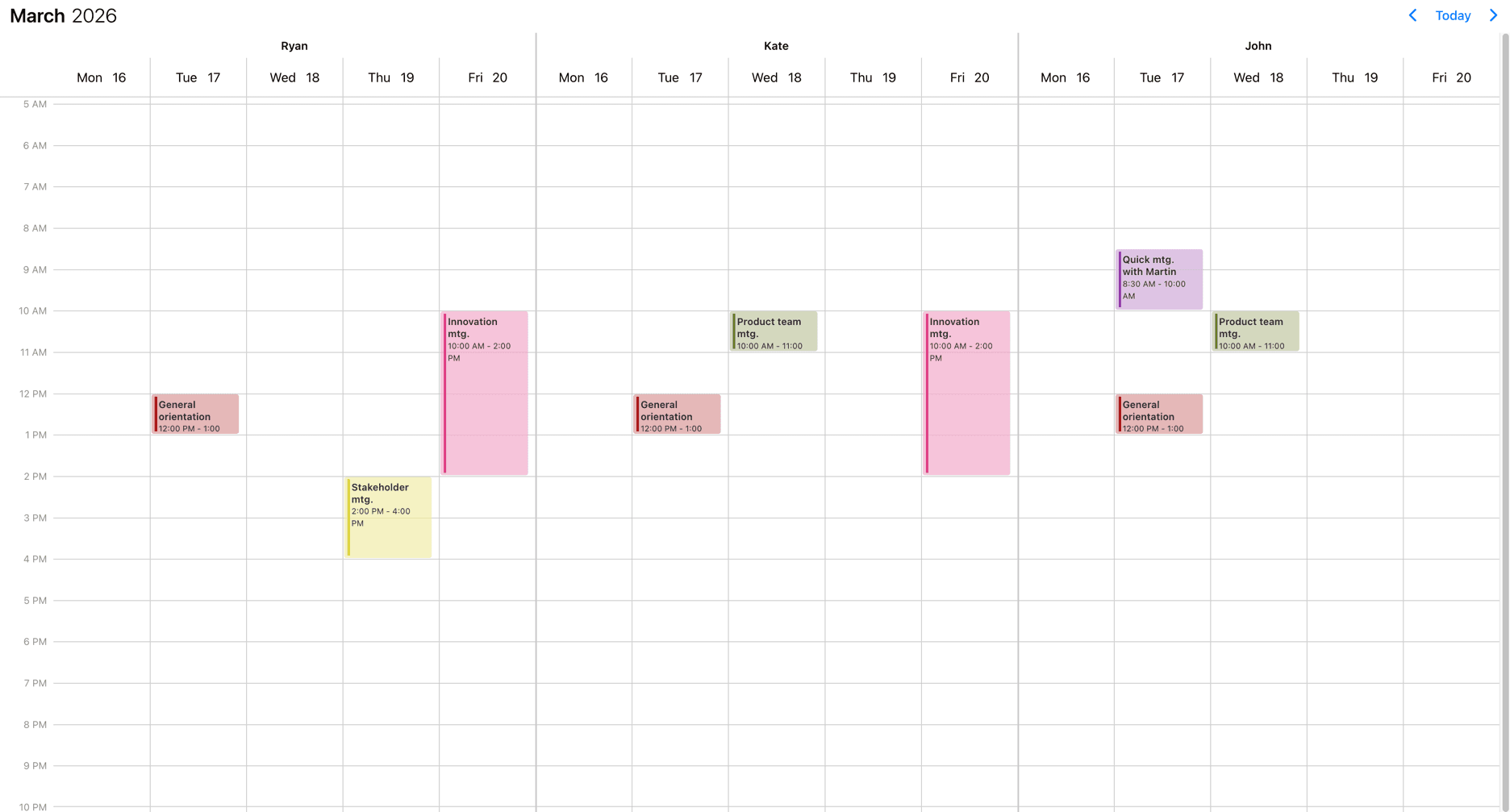
Resource templating
To customize the display of the resources, the renderResource option can be used.
import { Eventcalendar } from '@mobiscroll/react';
import '@mobiscroll/react/dist/css/mobiscroll.min.css';

const myResourceRenderer = (resource) => (<div>{resource.name} - {resource.location}</div>);

<Eventcalendar renderResource={myResourceRenderer} />
In case of the timeline view there are other parts of the Eventcalendar that can be customized through templates. Check out the timeline templating section for more details.
Play with the slider below to see the differences.
Header templating
The header of the calendar can be fully customized to one's needs with the use of the renderHeader option.
import { Eventcalendar } from '@mobiscroll/react';
import '@mobiscroll/react/dist/css/mobiscroll.min.css';

const myHeader = () => {
  return <>
    <p>Any <strong>Title</strong> you want here or</p>
    <your-custom-component yourProp="yourPropValue"></your-custom-component>
  </>
}

<Eventcalendar renderHeader={myHeader} />
While fully customizing the header is very usefull, sometimes it's desireable to customize only parts of it. In this case you can take advantage of the default header's building blocks. These components let you put toghether the header you want, while you don't have to worry about the functionality behind them.
For example you can leave out parts from the default header, change the order of the default buttons appearance or add custom components between them.
Here's the list of the built in components of the default header:
<CalendarPrev />- Previous button component, that navigates to the previous month.<CalendarNext />- Next button component, that navigates to the next month.<CalendarToday />- Today button component, that navigates to the current date.<CalendarNav />- The title navigation button component, that opens the year/month navigation.
The above components can be used inside of the custom header. The following example will render the prev and next buttons and then a custom title that is set from a custom variable (myTitle variable).
import { CalendarNext, CalendarPrev, Eventcalendar } from '@mobiscroll/react';
import '@mobiscroll/react/dist/css/mobiscroll.min.css';

const myTitle = 'Awesome title';
const myHeader = () => {
  return <>
    <CalendarPrev />
    <CalendarNext />
    <div class="my-custom-title">{myTitle}</div>
  </>
}

<Eventcalendar renderHeader={myHeader} />
Play with the slider below to see the differences.