Templating
The display of the Datepicker component can be customized with different render functions.
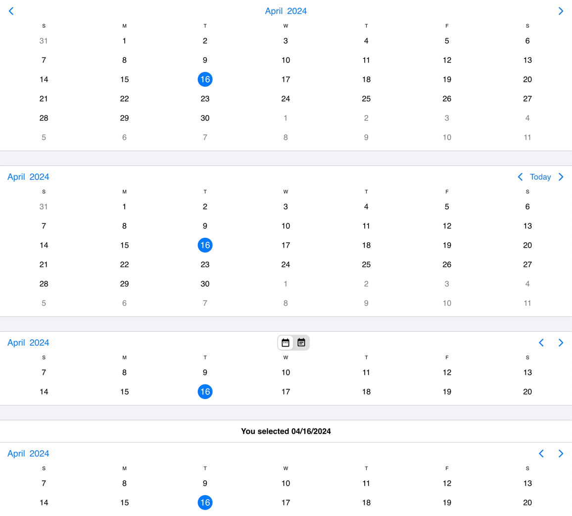
Calendar header template
The header of the calendar can be fully customized to one's needs with the use of the renderCalendarHeader option.
function myHeader() {
  return <>
    <p>Any <strong>Title</strong> you want here or</p>
    <YourCustomComponent yourProp="yourPropValue" />
  </>
}

function App() {
  return <Datepicker renderCalendarHeader={myHeader} />
}
While fully customizing the header is very usefull, sometimes it's desireable to customize only parts of it. In this case you can take advantage of the default header's building blocks. These components let you put toghether the header you want, while you don't have to worry about the functionality behind them.
For example you can leave out parts from the default header, change the order of the default buttons appearance or add custom components between them.
Here's the list of the built in components of the default header:
<CalendarPrev />- Previous button component, that navigates to the previous month.<CalendarNext />- Next button component, that navigates to the next month.<CalendarToday />- Today button component, that navigates to the current date.<CalendarNav />- The title navigation button component, that opens the year/month navigation.
The above components can be used inside of the custom header. The following example will render the prev and next buttons and then a custom title that is set from a custom variable (myTitle variable).
function App(props) {
  const myHeader = () => {
    return <>
      <CalendarPrev />
      <CalendarNext />
      <div class="my-custom-title">{{props.myTitle}}</div>
    </>
  }
  return <Datepicker renderCalendarHeader={myHeader} />
}
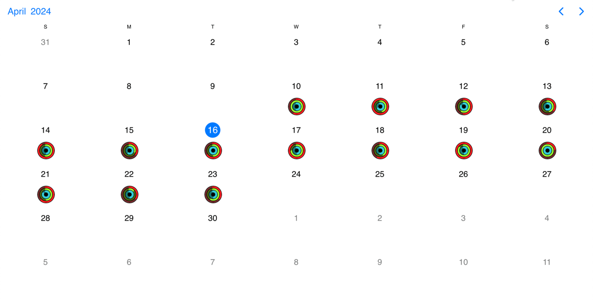
Calendar cell template
There are two options that enable the customization of calendar cells: the renderDayContent and the renderDay option.
The difference between the two is that the Datepicker will style the cells by default (background, hover, etc.) in the case of the renderDayContent option and will render the dates as usual. The custom content will be rendered after the dates in each cell.
In the case of the renderDay option however, both the styling and the content (the dates too) will come from the custom template.
function App() {
  const day = (args) => {
    return <>**{args.date.getDate()}**</>
  };
  return <Datepicker renderDay={day} />
}