Drag & drop
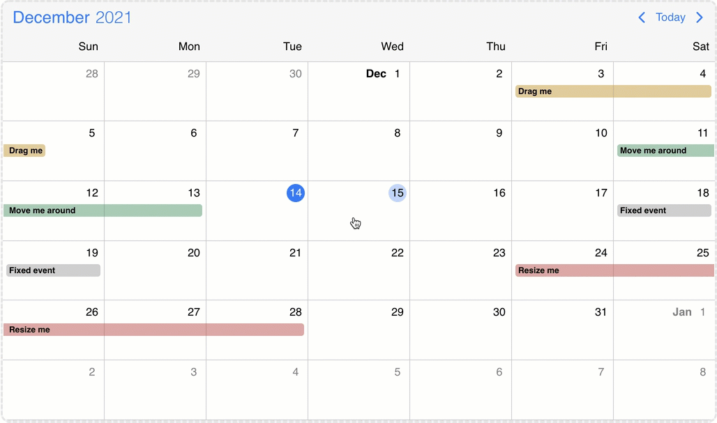
Calendar events can be created, moved and resized on the Eventcalendar. Furthermore it is possible to drag and drop events from an external source or to drag and drop to an external target from the Eventcalendar. The following sections describe how these solutions can be implemented and used.
Internal drag/resize/create
The events on the Eventcalendar can be moved and resized with mouse/touch interactions. The dragToMove and dragToResize options enable the events drag and drop and resize functionality. With the dragTimeStep option the minimum amount of drag/resize step can be specified in minutes.
With the dragToCreate option enabled, events can be created by dragging on the empty areas of the Eventcalendar. On a desktop environment a new event can also be created with the clickToCreate option.
To customize the newly created event use the extendDefaultEvent option.
Targeting the Eventcalendar
There is a possibility to drag & drop any external element into your calendar.
In order to achieve this, first you need to grant permission to your calendar to accept this behavior. You can do that by setting the externalDrop option to true.
As a second step, you'll have to create your external draggable element and pass a skeleton event definition through the dragData option which will be added to the Eventcalendar on drop. If omitted, a default event will be created.
Draggable
You can initialize the draggable containers by using the <Draggable /> component and reference the draggable container in the element option.
import { useState } from 'react';
import { Eventcalendar, Draggable } from '@mobiscroll/react';

function App() {
  const [dragEl, setDragEl] = useState(null);
  const myData = {
    title: "My new 3h long event",
    start: new Date(2023, 10, 10, 12),
    end: new Date(2023, 10, 10, 15),
    color: "green",
  };

  return <>
    <div ref={setDragEl}>
      <div>My Draggable event</div>
      <Draggable element={dragEl} dragData={myData} />
    </div>

    <Eventcalendar externalDrop={true} />
  </>
}
Draggable options
context
string | HTMLElement
Specify where the dragged element will be appended in the DOM.
dragData
string | MbscCalendarEvent | MbscResource
The data of the dragged element.
The MbscCalendarEvent type has the following properties:
allDay: boolean - Specifies if the event is all day or not.bufferAfter: number - Defines a buffer time in minutes that will be displayed after the end of the event.bufferBefore: number - Defines a buffer time in minutes that will be displayed before the start of the event.cellCssClass: string - CSS class for the day cell. Only applicable for the calendar view.color: string - Background color of the eventcssClass: string - Specifies a custom CSS class that is applied to the event. Useful when customization is needed on the event level. For example: setting the width for specific events.date: string | object | Date - Specifies a single date for the eventdragBetweenResources: boolean - Specifies whether the event is movable across resources.dragBetweenSlots: boolean - Specifies whether the event is movable across across slots.dragInTime: boolean - Specifies whether the event is movable in time.editable: boolean - Specifies if an event is editable or not. If false, drag & drop and resize is not allowed.end: string | object | Date - Specifies the end date/time of a date/time range for the eventid: string | number - A unique id for the event. If not specified, the event will get a generated id.order: number - Specifies the order of the event in the array. Has precedence over the default ordering rules.overlap: boolean - Specifies whether the event can be overlapped. Has precedence over theeventOverlapproperty of the resource and the eventOverlap option.recurring: string | MbscRecurrenceRule - Specifies a recurrence rule for handling recurring events.recurringException: string | object | Date | Array<string | object | Date> - Exception dates of the recurring rule. Useful when specific dates need to be skipped from the rule.recurringExceptionRule: string | MbscRecurrenceRule - Exception rule of the recurring rule. Useful when recurring dates need to be skipped from the rule.resize: boolean - Specifies whether the event is resizable. Has precedence over theeventResizeproperty of the resource and the dragToResize option.resource: string | number | Array<string | number> - In case of the timeline and scheduler view of the Eventcalendar, specifies the resource ids for the event. The event will be displayed only on the specified resource. If there is no resource defined, it will be displayed on every resource.slot: string | number - In case of the timeline view of the Eventcalendar, specifies the slot id for the event. The event will be displayed only on the specified slot. If there is no slot defined, it will be displayed on every slot.start: string | object | Date - Specifies the start date/time of a date/time range for the eventtextColor: string - A color applied on the text.timezone: string - Timezone of the eventtitle: string - The title of the event.tooltip: string - The tooltip text of the event.
The MbscResource type has the following properties:
background: string - Specifies the background color of the resource row or column.children: Array<MbscResource> - Child resources.collapsed: boolean - Specifies the displayed state of the child resource group.color: string - Specifies the default event color of the resource. If an event has an explicit color set, the resource color will be overridden. If the color is not set, the events of the resource will inherit the default calendar color.cssClass: string - Specifies a css class for the resource row or column.eventCreation: boolean - Disables event creation on specific resources by setting it to false. Defaults to true.eventDragBetweenResources: boolean - Specifies whether the events in this resource are movable across resources. It applies for scheduler and timeline views. Has precedence over the dragBetweenResources option.eventDragBetweenSlots: boolean - Specifies whether the events in this slot are movable across slots. Has precedence over the dragBetweenSlots option.eventDragInTime: boolean - Specifies whether the events in this resource are movable in time. Has precedence over the dragInTime option.eventOverlap: boolean - Specifies whether the events in this resource can be overlapped. Has precedence over the eventOverlap option.eventResize: boolean - Specifies whether the events in this resource are resizable. Has precedence over the dragToResize option.fixed: boolean - Specifies whether the resource is fixed to the top. It applies for timeline view ifresolutionVerticalin view option is not given, or it's value is set tonone. Consider that the fixed resources always have to be the first elements of the array in a sequence (no non-fixed resources inserted in between) so that the dra & rop and event creation functionalities to work properly.id: string | number - The id of the resource.name: string - Specifies the name of the resource.reorder: boolean - Specifies whether the resource can be dragged and reordered. It applies for timeline view ifresourceReorderin view option is enabled.
element
HTMLElement
The HTML element of the dragged item.
type
"event" | "resource"
The type of the draggable element.
Third party dragging libraries
Mobiscroll comes with built-in support for two widely used reorderable drag-and-drop list libraries: SortableJS and Dragula. With the sortableJsDraggable and dragulaDraggable plugins, you can seamlessly drag items into the Eventcalendar with just a few lines of code.
SortableJS:
Integration: call the sortableJsDraggable plugin’s init() method and pass the SortableJS instance along with the options object.
The options object can include the following properties:
cloneSelector- string - the selector of the SortableJS clone element, typically'.sortable-drag'dragData- (el: HTMLElement) => MbscCalendarEvent | MbscResource - function to build the resource or event object. Defaults todata-drag-dataattribute on the element.type- 'event' | 'resource' - Creates an event or resource on the Eventcalendar. Defaults to'event'.externalDrop- boolean - Enables drop from Eventcalendar to SortableJS list.onExternalDrop- (args: {container: HTMLElement, position: number, dragData: MbscCalendarEvent | MbscResource, afterElement?: HTMLElement}) => void - function triggered on drop from Eventcalendar to SortableJS list.
import { Eventcalendar, sortableJsDraggable} from '@mobiscroll/react';
import { useEffect } from 'react';
import Sortable from 'sortablejs';

function App() {
  useEffect(() => {
    const sortableList = document.getElementById('sortable-list');
    const sortableInst = Sortable.create(sortableList, {
      animation: 150,
      forceFallback: true,
    });

    sortableJsDraggable.init(sortableInst, {
      cloneSelector: '.sortable-drag',
    });
  }, []);

  return <>
    <div className="mbsc-form-group-title">Sortable appointments</div>
      <div id="sortable-list">
        <div className="task" data-drag-data='{ "title": "Winfred Lesley - Teeth whitening", "start": "00:00", "end": "01:30" }'>
          <div>Winfred Lesley - Teeth whitening</div>
          <div>1.5 hours</div>
        </div>
        <div className="task" data-drag-data='{ "title": "Rosalin Delice - Crown and bridge", "start": "00:00", "end": "02:00" }'>
          <div>Rosalin Delice - Crown and bridge</div>
          <div>2 hours</div>
        </div>
      </div>
    </div>
    <Eventcalendar externalDrop={true} />
  </>
}
The SortableJS integration works only if fallback mode is used.
The cloneSelector must be set in the options object.
Dragula:
Integration: call the dragulaDraggable plugin’s init() method and pass the Dragula instance, optionally providing an options object to customize the behavior.
The options object can include the following properties:
dragData- (el: HTMLElement) => MbscCalendarEvent | MbscResource - function to build the resource or event object. Defaults todata-drag-dataattribute on the element.type- 'event' | 'resource' - Creates an event or resource on the Eventcalendar. Defaults to'event'.externalDrop- boolean - Enables drop from Eventcalendar to Dragula list.onExternalDrop- (args: {container: HTMLElement, position: number, dragData: MbscCalendarEvent | MbscResource, afterElement?: HTMLElement}) => void - function triggered on drop from Eventcalendar to Dragula list.
import dragula from 'dragula';
import { Eventcalendar, dragulaDraggable} from '@mobiscroll/react';
import { useEffect } from 'react';

function App() {
  useEffect(() => {
    const dragulaList = document.getElementById('dragula-list');
    const drake = dragula([dragulaList], {
      copy: true,
    });
    dragulaDraggable.init(drake);
  }, []);

  return <>
    <div className="mbsc-form-group-title">Dragula appointments</div>
      <div id="dragula-list">
        <div className="task" data-drag-data='{ "title": "Winfred Lesley - Teeth whitening", "start": "00:00", "end": "01:30" }'>
          <div>Winfred Lesley - Teeth whitening</div>
          <div>1.5 hours</div>
        </div>
        <div className="task" data-drag-data='{ "title": "Rosalin Delice - Crown and bridge", "start": "00:00", "end": "02:00" }'>
          <div>Rosalin Delice - Crown and bridge</div>
          <div>2 hours</div>
        </div>
      </div>
    </div>
    <Eventcalendar externalDrop={true} />
  </>
}
When using the Dragula integration on touch devices, draggable items require the following CSS rule to ensure proper behavior:
.task { touch-action: none; }
This is a known limitation in Dragula’s touch support that has not been addressed yet.
The Eventcalendar as source
The externalDrag option enables events to be dragged out from the calendar/schedule/timeline views and dropped on another instance of the Eventcalendar or any Dropcontainer.
When an event leaves the Eventcalendar the onEventDragLeave life-cycle event will be fired and a clone of the calendar event will be displayed for a better illustration of the movement. If the dragToMove option is not enabled the dragged event will instantly leave the calendar container and the onEventDragLeave event will fire and the event clone will be displayed. When an event enters the Eventcalendar the onEventDragEnter life-cycle event will be fired.
Dropcontainer
The Dropcontainer defines a container where events can be dragged from or dropped to. The onItemDragLeave and onItemDragEnter life-cycle events can be used to track when an event exits or enters the Dropcontainer. When an item is dropped inside the container the onItemDrop event is triggered. This can be useful for unscheduling work or appointments that were already scheduled.
import { setState } from 'react';
import { Draggable, Dropcontainer, Eventcalendar } from '@mobiscroll/react';

function MyTask({ event }) {
  const [draggableEl, setDraggableEl] = useState(null);
  return <li ref={setDraggableEl}>
    <div>{event.title}</div>
    <Draggable dragData={event} element={draggableEl} />
  </li>
}

function MySchedule() {
  const [dropcontainerEl, setDropcontainerEl] = useState(null);
  const [unscheduledEvents, setEvents] = useState<MbscCalendarEvent[]>([
    {
        id: 1,
        title: "My new 3h long event",
        start: new Date(2023, 10, 10, 12),
        end: new Date(2023, 10, 10, 15),
        color: "green",
    },
  ]);
  const unscheduleEvent = (dropEvent) => {
    setEvents([...unscheduledEvents, dropEvent.data]);
  }
  const scheduleEvent = (args) => {
    setEvents(unscheduledEvents.filter(item => item.id !== args.event.id));
  }
  return <>
    <div ref={setDropcontainerEl}>
      <Dropcontainer element={dropcontainerEl} onItemDrop={unscheduleEvent}>
        <div>Events:</div>
        {unscheduledEvents.map((event) => <MyTask key={event.id} event={event} />)}
      </Dropcontainer>
    </div>
    <Eventcalendar
      externalDrop={true}
      externalDrag={true}
      dragToCreate={true}
      dragToMove={true}
      onEventCreate={scheduleEvent}
    />
  </>
}
Dropcontainer events
onDestroy
(args: any, inst: any) => void
Triggered when the component is destroyed.
Parameters:
-
args - The event argument object.
-
inst - The component instance.
onInit
(args: any, inst: any) => void
Triggered when the component is initialized.
Parameters:
-
args - The event argument object.
-
inst - The component instance.
onItemDragEnter
(args: MbscItemDragEvent) => void
Triggered when an event is dragged into the calendar/timeline/schedule view.
Parameters:
- args - The event argument with the following properties:
domEvent: Event - The DOM event of the drag.data: *MbscCalendarEvent | MbscResource * - The dragged data.dataType: 'event' | 'resource' - The type of the dragged item.
onItemDragLeave
(args: MbscItemDragEvent) => void
Triggered when an event is dragged into the calendar/timeline/schedule view.
Parameters:
- args - The event argument with the following properties:
domEvent: Event - The DOM event of the drag.data: *MbscCalendarEvent | MbscResource * - The dragged data.dataType: 'event' | 'resource' - The type of the dragged item.
onItemDrop
(args: MbscItemDragEvent) => void
Triggered when an event is dropped inside the drop container.
Parameters:
- args - The event argument with the following properties:
domEvent: Event - The DOM event of the drag.data: *MbscCalendarEvent | MbscResource * - The dragged data.dataType: 'event' | 'resource' - The type of the dragged item.
Drop to third party drag&drop list
Mobiscroll comes with built-in support for dropping events and resources from the Eventcalendar to two of the most popular reordable drag and drop lists: SortableJS and Dragula. Unscheduling events or drag out resources can be enabled with the sortableJsDraggable and dragulaDraggable plugins.
Integration: enable dropping to third-party lists by setting externalDrop to true in the sortableJsDraggable or/and dragulaDraggable plugin’s options configuration and use the onExternalDrop callback to update the list. This function returns the following arguments:
afterElement- HTMLElement - the list element before which the clone is dropped.container- HTMLElement - the list container.dragData- MbscCalendarEvent | MbscResource - the dragged data.position- number - the index where the clone is dropped.
  // options object of the sortableJsDraggable or dragulaDraggable
  // enable drop from Eventcalendar to Dragula or SortableJS list
  externalDrop: true,
  // update the list items after drop event
  onExternalDrop: (args: MbscExternalDropEvent) => {
    setMyList((prev) => {
      const listItems = [...prev];
      listItems.splice(args.position, 0, args.dragData);
      return listItems;
    });
  },